VueTools: one PrimeVue theme for MODX 3 components
One of the small but important challenges when building Vue-based extras for MODX 3 is keeping their UI consistent with the Manager.
With the latest VueTools changes, this becomes much easier: the PrimeVue theme can now be selected globally from MODX system settings.
One setting for all components
VueTools 1.2.0 introduces the vuetools.theme system setting.
There are currently two available themes:
-
aura— the standard PrimeVue Aura theme and the default option; -
modx— a PrimeVue theme designed to look closer to the MODX Revolution 3 Manager.
The setting can be found under:
System → System Settings → vuetools.theme
After changing it, all components that use the VueTools theme API can switch their appearance without rebuilding them.
How does it work?
For an extra developer, the important part is that you no longer need to hardcode a specific theme.
Instead of:
app.use(PrimeVue, {
    theme: Aura
})
you can use:
import { PrimeVue } from 'primevue'
import { getActiveTheme } from '@vuetools/useTheme'

app.use(PrimeVue, getActiveTheme())
If you also use the VueTools PrimeVue locale:
import { getPrimeVueLocale } from '@vuetools/usePrimeVueLocale'
import { getActiveTheme } from '@vuetools/useTheme'

app.use(PrimeVue, {
    ...getActiveTheme(),
    locale: getPrimeVueLocale()
})
getActiveTheme() reads the current MODX setting and returns the corresponding PrimeVue configuration.
This means the component itself doesn’t need to know which theme is currently selected.
A new MODX-style PrimeVue theme
VueTools now includes a dedicated Modx preset for PrimeVue.
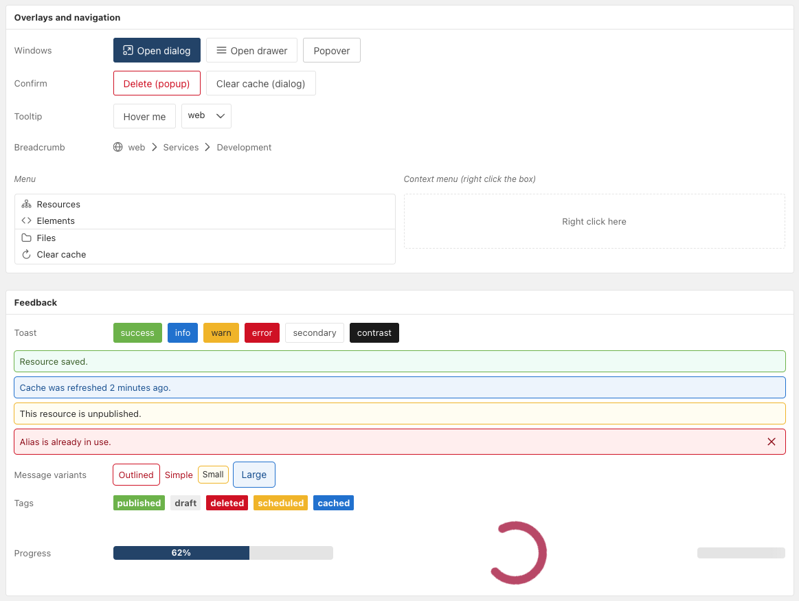
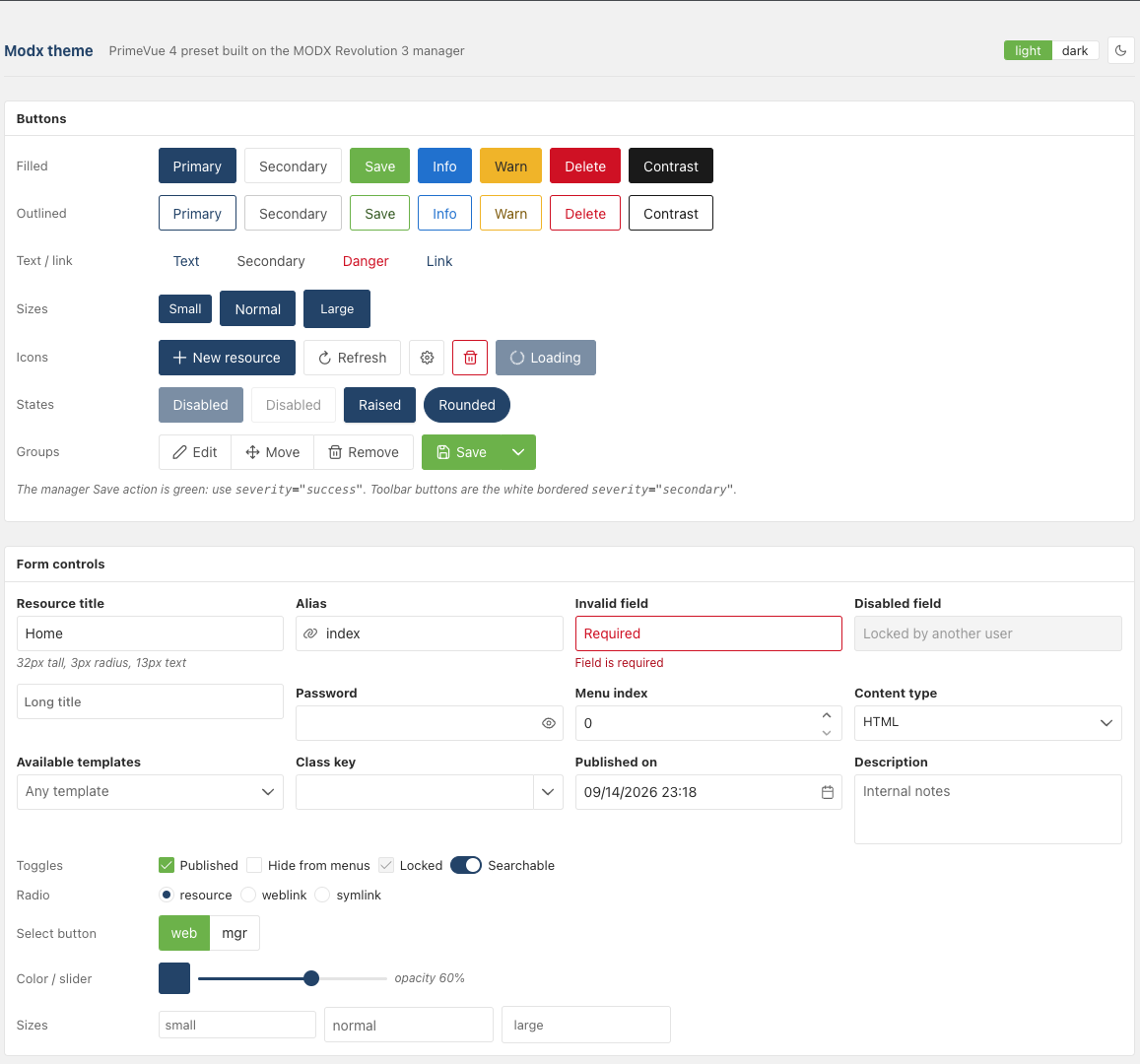
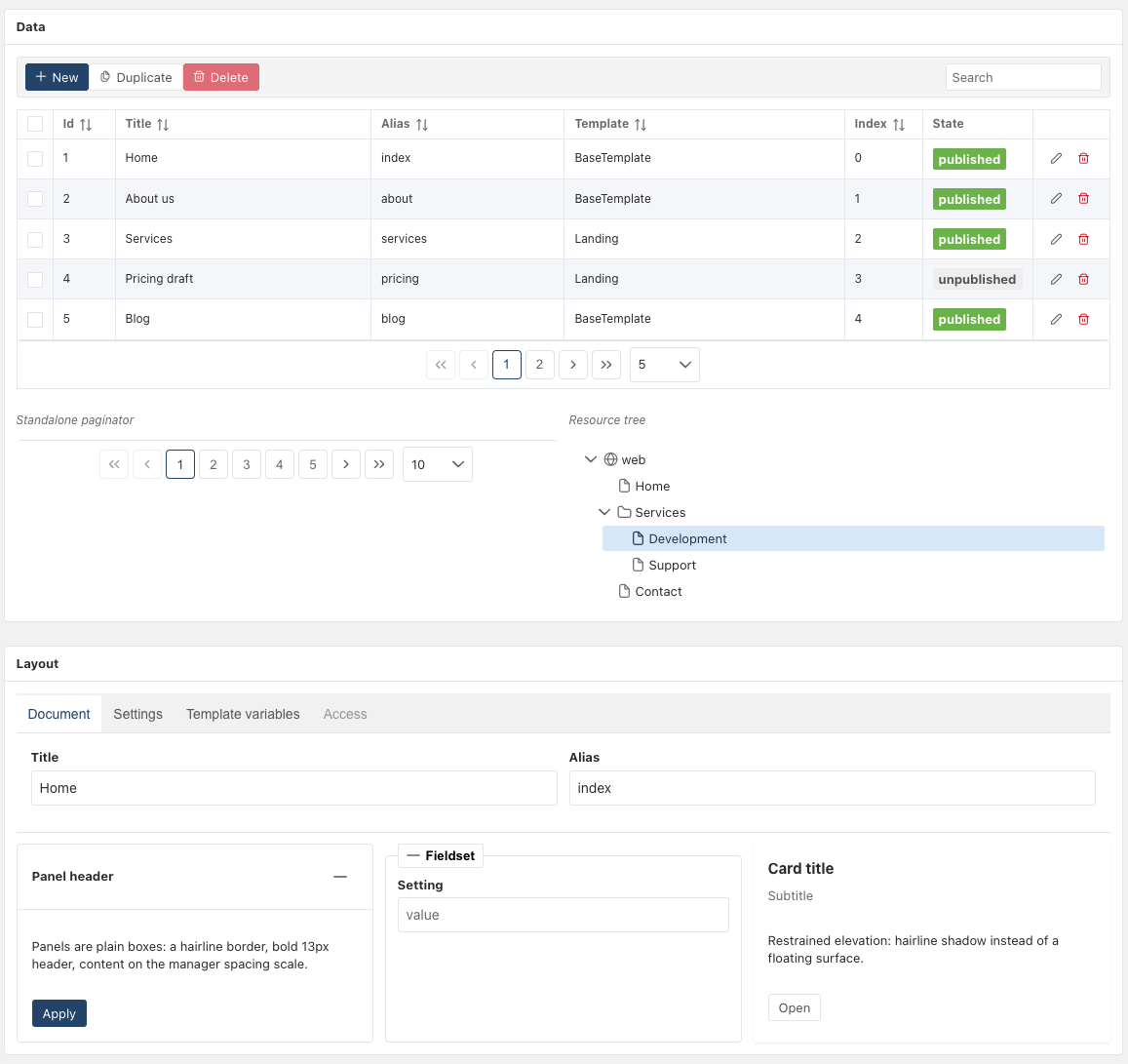
The goal is not to reproduce the old ExtJS interface pixel by pixel, but to make modern Vue components feel like a natural part of the MODX 3 Manager.
The theme includes:
-
compact 13px typography;
-
3px border radius;
-
MODX-style colors and controls;
-
denser tables and tabs;
-
Manager-like primary actions and focus states;
-
a light-only configuration matching the current MODX Manager.
What about existing extras?
Updating VueTools does not require existing components to be migrated immediately.
The default value of vuetools.theme is aura, so components using Aura continue to look the same.
Components that explicitly hardcode Aura or another theme also continue to work as before. They simply won’t participate in the global theme switch until they are migrated to getActiveTheme().
This makes the migration incremental — an extra doesn’t need to be rewritten just because VueTools was updated.
You can also extend the MODX theme
The MODX preset can be customized instead of being replaced completely.
For example:
import { definePreset, Modx } from 'primevue'

const MyPreset = definePreset(Modx, {
    semantic: {
        primary: {
            500: '#1a3a5c'
        }
    }
})
This allows an extra to keep the overall MODX look while adding its own visual adjustments.
Updated VueTools documentation
Along with the theme changes, the VueTools documentation has been updated for version 1.2.0.
The documentation now covers the current API, including:
-
useApi; -
useLexicon; -
useModx; -
usePermission; -
usePrimeVueLocale; -
getActiveTheme; -
PrimeVue barrel imports;
-
VueTools Import Map aliases.
Several outdated API names and examples were also corrected to match the current implementation.
Why this matters
For developers building Vue-based MODX extras, the main benefit is simple:
the visual style can now be treated as a shared platform concern instead of something every extra has to solve independently.
An extra can use the VueTools API, respect the global MODX theme setting, and let the administrator decide whether to use the standard PrimeVue appearance or the MODX-style interface.
This should make it easier to build modern MODX 3 extras that look consistent with each other and with the Manager.
The implementation is available in Modstore, extras.modx.com (Soon), and the documentation has been updated in Docs.
Feedback, testing and ideas for improving the MODX theme are very welcome.